The Colorado Flood Relief Bundle has come to an end. With your help, we raised just about $5500! If you didn’t get an opportunity to participate, you can still donate at the Great Colorado Flood Relief Project.
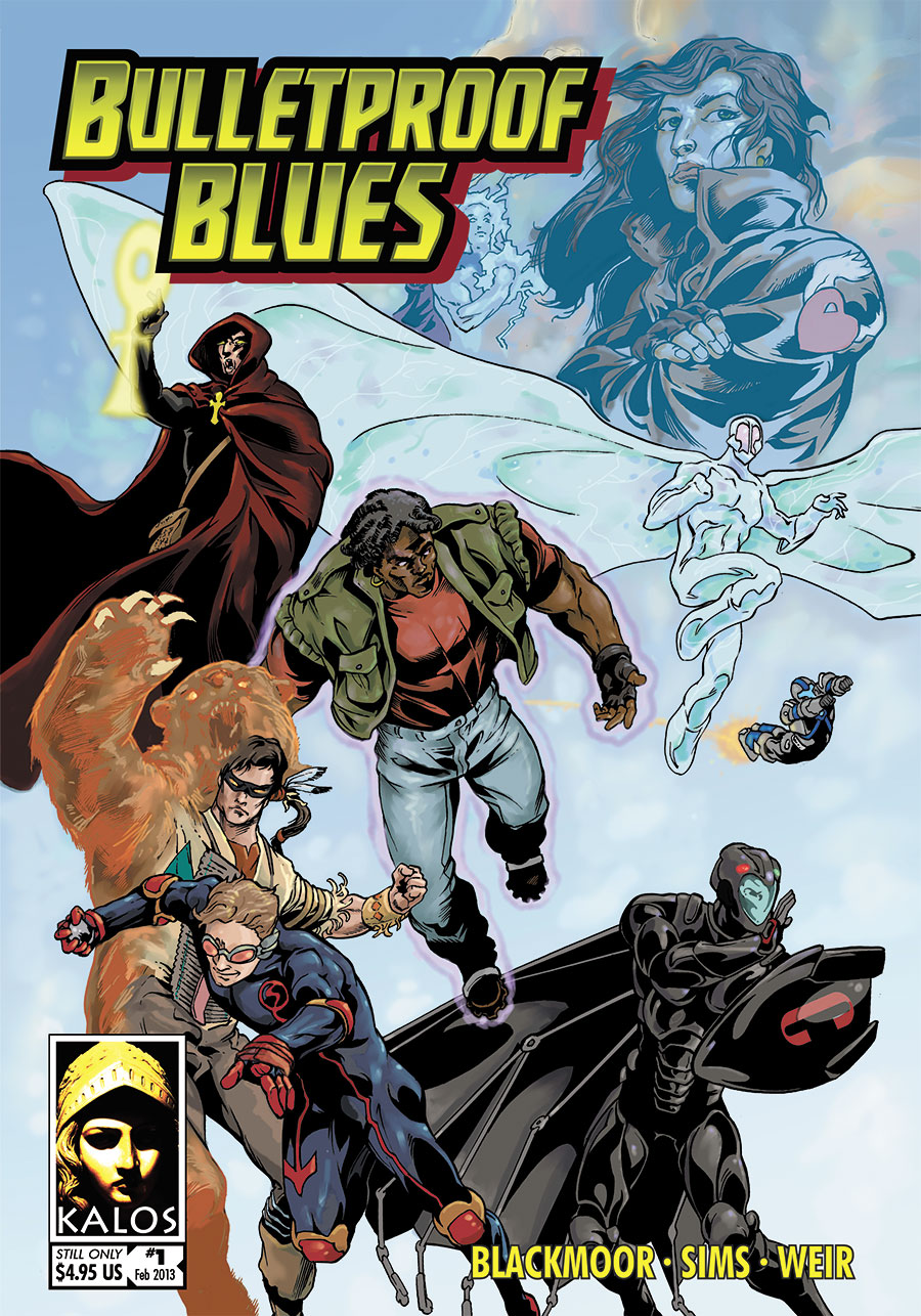
Elsewhere on the Internet, John Taber has written a very comprehensive review of Bulletproof Blues over at Kingbeast’s Lair. He went into some detail on what he liked and what he didn’t, and it’s worth your time to read it.
I will share with you some of the reasons behind a couple of the things John didn’t like. This doesn’t mean John is wrong: there is room in the world for everyone to like what they like. But I thought you might appreciate an explanation.
The layout is intentionally simple: a single column of black text on white background, with the text being slightly larger than one usually finds in roleplaying games. We did this for two main reasons. First, the book is primarily intended to be read on a computer screen, especially a tablet. We wanted to make it as easy as possible to read. That’s why it’s in a single column, and why there are very few colors and images behind the text. Second, there are many gamers with vision impairments. We wanted to make sure that the game is accessible to everyone.
John is right that the game has much less art than you will find in most other games of similar quality. The main motivation behind that is a prosaic one: cost. Art, particularly good art, is expensive. We tried to make the book as attractive as we could while keeping the cost as reasonable as possible. Would we like to have a “deluxe” version, with more art? Certainly. But it would be more expensive — much more expensive. It was more important to us that the game be affordable to everyone who might want to play it. If the game becomes hugely popular, and makes us many thousands of dollars, virtually all of that money will go toward art. In the meantime, we hope that people enjoy playing it. 🙂
Could the game be organized better, and could the layout be improved? Absolutely. We went through many iterations of the sample character layout, for example, and we’re still not entirely happy with it. And as John pointed out, the wide tables are a problem that we never did find a satisfactory solution for (although we tried). If you have suggestions for improving the layout, or the game itself, we are always happy to listen (although listening doesn’t mean we will necessarily follow your advice!).
One thing John didn’t mention, which I personally think is particularly important, is that Bulletproof Blues is a completely open game. The game is dual-licensed under both the Open Game License and the Creative Commons Attribution-ShareAlike license. Anyone can write supplements for it, or even base a whole new game on it. Choose the license that best fits your purposes, and go to town! We will cheer you on with the greatest enthusiasm.
Go read John’s review, and poke around the rest of his web site. He has some interesting stuff over there.

